Designing custom t-shirts isn’t just about style – it’s a powerful tool for branding, marketing, and fundraising. With the global custom t-shirt printing market projected to grow from $3.64 billion in 2020 to $7.57 billion by 2028, there’s never been a better time to get started. But to stand out, your designs need to be professional, memorable, and impactful.
Here’s a quick rundown of the 7 essential tips covered in this guide:
- Master Design Basics: Focus on layout, fonts, and fabrics for a polished look.
- Choose the Right Tools: From beginner-friendly Canva to pro-level Adobe Illustrator.
- Pick the Perfect Colors: Align with your brand and ensure print accuracy.
- Prepare Print-Ready Files: Use high-resolution formats and proper specs for clean results.
- Strategic Design Placement: Optimize for chest, back, or sleeve prints.
- Test Your Designs: Use digital previews and physical samples to avoid costly mistakes.
- Ensure Longevity: Select durable materials, inks, and follow proper care instructions.
Quick Comparison: Design Tools
| Tool | Skill Level | Features | Cost |
|---|---|---|---|
| Canva | Beginner | Templates, drag-and-drop | Free/$12.99/mo |
| Adobe Illustrator | Advanced | Vector graphics, CMYK support | $20.99/mo |
| CorelDRAW | Advanced | Professional tools, one-time license | $549 |
This guide will walk you through each step to help you create t-shirts that look great, last long, and make an impression. Let’s dive in!
What To Use When Creating A T-Shirt Design
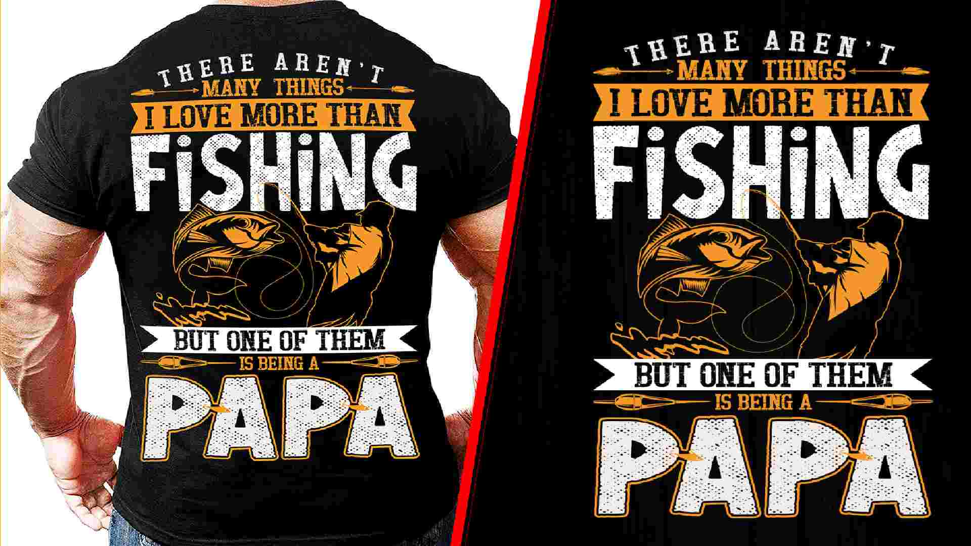
1. T-Shirt Design Fundamentals
To make the most of your t-shirt’s potential to reach up to 3,400 impressions, it’s important to focus on the basics of design. These elements influence both how your shirt looks and how it meets the technical requirements discussed later.
Layout and Space Management
A balanced design is key. Aim for a 30-70 ratio of design elements to blank space .
Key tips for layout:
- Use a 3×3 grid for alignment.
- Focus on a single focal point to draw attention.
- Keep text margins at 0.25 inches for a clean look.
Text and Font Selection
For t-shirts, sans-serif fonts like Helvetica and Arial work best .
Here’s a quick guide to text sizes:
| Element | Size | Purpose |
|---|---|---|
| Main Message | 14-22pt | Grabs attention |
| Details | 10-14pt | Adds supporting information |
| Spacing | 120-150% | Ensures readability |
Place text 2-3 inches below the neckline to avoid distortion and ensure the message stays clear when worn.
Working with Different Fabrics
The type of fabric you choose can greatly affect how your design looks and lasts. Here’s a breakdown:
- Cotton: Great for bold, vibrant screen prints. Pre-shrunk options are ideal.
- Polyester: Works best with dye sublimation .
- Tri-Blends: Trendy and offer textured finishes .
Match your fabric choice to your design goals (discussed in Section 3 on color selection) to ensure the best results. Knowing fabric strengths and limitations also helps when deciding on printing methods (covered in Section 4).
2. Design Software Options
Picking the right design software is key to creating professional t-shirt designs. Your choice should match your skill level, design goals (as discussed in Section 1), and budget. It also plays a big role in how well you handle fabric-specific needs outlined earlier.
Simple Design Tools
If you’re just starting out or need quick, easy designs, there are plenty of beginner-friendly platforms to explore. Canva, for example, stands out with its massive library of over 20,000 t-shirt templates and an impressive 4.7/5 rating from more than 14,000 reviews on G2 . Its drag-and-drop interface makes it perfect for creating basic designs without prior experience.
Features of simple tools include:
- Easy-to-use drag-and-drop interfaces
- Pre-designed templates to save time
- Basic color adjustment options
- Standard font collections
Advanced Design Programs
For more complex or professional projects, advanced software is the way to go.
Adobe Illustrator is a go-to option for vector graphics, crucial for creating scalable designs, and is available for $20.99/month. Another popular choice is CorelDRAW, which offers a one-time purchase license for $549 and includes specialized drawing tools.
Key features of advanced programs:
- Vector tools for sharp, scalable designs
- Professional-grade color systems like CMYK and Pantone
- Export options in formats like SVG and PDF
- Layer management for detailed designs
- Tools for color separation, ideal for screen printing
When deciding, consider:
- The complexity of your designs
- How precise your colors need to be
- Your budget
- Your technical skills
These tools are especially useful for handling intricate color schemes (covered in Section 3) and preparing designs for print (explored in Section 4). They ensure your final designs are print-ready and meet durability standards discussed in Section 7.
3. Color Selection and Matching
The colors you choose can greatly influence the success of your t-shirt design. Studies indicate that 62-90% of how people judge products is based on color alone . This makes picking the right palette for your custom t-shirts an important step.
Colors and Brand Message
Your color choices should align with your brand’s identity while also considering the psychological effects of colors. Using signature colors can increase brand recognition by up to 80% . Below is a quick guide to how certain colors are often perceived and used:
| Color | Message | Common Uses |
|---|---|---|
| Red | Energy, passion, urgency | Sports teams, action-oriented brands |
| Blue | Trust, calmness, professionalism | Corporate wear, tech companies |
| Green | Nature, growth, health | Eco-friendly brands, wellness |
| Yellow | Optimism, cheerfulness | Youth brands, summer collections |
| Purple | Luxury, creativity | Arts, premium brands |
Stick to 3-5 colors to keep the design impactful and manage production costs . Combine these principles with the design tools discussed in Section 2 for the best results. Plus, your color choices will directly affect the print quality – a topic covered in Section 7.
Print-Ready Color Setup
Your chosen colors need to work seamlessly with your selected printing method (explained in Section 4). Proper preparation ensures your design looks as intended.
Screen Printing Setup
- Keep a minimum line thickness of 0.5pt for clean prints.
DTG (Direct-to-Garment) Requirements
- Use Section 2’s recommended software to convert RGB to CMYK.
- Account for potential color shifts due to fabric texture.
Adjust colors based on the shirt’s base color (dark or light). For precise color matching, use calibrated monitors and request physical swatches from your printer. This step helps avoid costly errors and ensures your final product matches your expectations.
4. Print-Ready Design Setup
Follow these technical guidelines to ensure high-quality prints:
File Specs and Formats
| Specification | Requirement | Purpose |
|---|---|---|
| Resolution | 300 DPI minimum | Ensures sharp and clear prints |
| File Format | AI, EPS, PDF (vector) or PSD, TIFF, PNG (raster) | Preserves scalability and detail |
| Bleed Area | 1/4 inch (6mm) | Avoids unwanted white edges |
Convert all text to outlines to avoid font substitution issues. For designs combining text and images, use separate layers for each element to make adjustments easier. Utilize the advanced tools mentioned in Section 2 to meet these requirements.
Printing Methods Comparison
Building on the color guidelines covered in Section 3, here’s how different printing methods serve various design needs:
Screen Printing
Best for simple designs with solid colors, especially for large production runs. Setup costs typically range from $200-$800 per design .
Direct-to-Garment (DTG)
Perfect for detailed, multi-colored designs or smaller batches. Setup costs range from $100-$150 . Key benefits include:
- Photorealistic detail reproduction
- Unlimited color options
- Great results on light-colored fabrics
Heat Transfer
A cost-effective choice for prototypes or small orders, with setup costs between $50-$100 . However, prints may wear out faster compared to other methods.
Provide these specifications to your printer and always request a proof before starting production.
sbb-itb-6f4c5a1
5. Design Placement Guide
Where you place your design can make or break a t-shirt’s appeal. Thoughtful placement and proper scaling ensure your design looks polished and works across all shirt sizes. Plus, it helps you tap into a t-shirt’s potential to generate thousands of impressions (see Section 1).
Standard Print Locations
Front chest designs are by far the most popular, making up about 60% of all t-shirt prints. Here’s a quick reference for common print locations and their typical dimensions:
| Location | Width | Distance from Collar |
|---|---|---|
| Center Chest | 8-10" | 8-10" down |
| Full Front | 11-14" | 3-4" down |
| Upper Back | 6-8" | 5-6" down |
| Full Back | 11-14" | 5-6" down |
| Sleeve | 3-3.5" | N/A |
For branding, left chest designs are a go-to option. They’re usually 3-4 inches wide and work well for logos or small emblems. If you’re designing wrap-around prints, make sure the elements line up seamlessly on both sides.
Shirt style also matters. V-necks need higher placement to avoid awkward alignment with the neckline, while tank tops call for more compact designs due to their smaller surface area. For long-sleeve shirts, printing along the sleeve can add a striking visual element.
Size-Based Design Scaling
Design scaling ensures your artwork looks balanced, no matter the shirt size. A good rule of thumb is to reduce the design width by 0.5-1 inch for each size below XL:
- XL: 12"
- L: 11-11.5"
- M: 10-10.5"
- S: 9-10"
For designs with multiple elements, keep the spacing consistent across all sizes to maintain a cohesive look.
"The placement of designs significantly impacts both the aesthetic appeal and wearability of a t-shirt. Centrally placed designs on the chest or back create a balanced look and are generally considered the most versatile."
Dark-colored shirts require more careful placement to ensure the design stands out, while light-colored shirts offer more freedom. For the best results, test your scaled designs following the protocols in Section 6. Pair these scaling tips with the color contrast techniques discussed in Section 3 for maximum impact.
6. Design Testing Methods
Testing your t-shirt designs before going into full production is a smart way to avoid expensive errors and ensure your final product looks polished. By combining digital tools with physical samples, you can thoroughly evaluate your design choices.
Digital Preview Tools
Leverage your design software (see Section 2) with visualization platforms like these:
- Adobe Dimension: Provides high-quality 3D mockups, realistic fabric simulations, and advanced lighting controls.
- Placeit: An easy-to-use online platform with a wide range of templates for quick mockups.
| Tool | Key Features |
|---|---|
| Adobe Dimension | Realistic lighting, material control |
| Placeit | Extensive template options |
When using these tools, check your designs on multiple devices to ensure they look consistent. A design that looks great on your computer might appear off on a smartphone or tablet. Also, simulate different lighting conditions to confirm colors remain vibrant and contrasts are strong.
Sample Print Review
Digital previews are helpful, but physical samples can uncover issues you might otherwise miss. Use a structured approach to evaluate your samples:
- Color accuracy: Compare the printed version to your digital design.
- Fabric stretch: Check if the design distorts when the fabric stretches.
- Durability: Run 3-5 wash cycles following the manufacturer’s care instructions.
- Wear test: Have someone wear the t-shirt for a day to assess comfort and durability.
Watch for common problems like color mismatches, misaligned prints, or inconsistent quality across different sizes. If you spot issues, tweak your digital files or consider other printing methods.
Keep in mind that print quality can vary depending on the fabric color. For instance, designs with colors similar to the fabric tone may lose visibility. These physical tests also help confirm your material choices (see Section 1) and printing techniques (see Section 4).
7. Making Designs Last
After testing your designs (as discussed in Section 6), focus on keeping them intact over time by choosing the right materials and printing techniques. Here’s how to ensure your designs stand the test of time:
Material Quality Standards
The fabric you choose plays a big role in how well your designs hold up. High-quality, pre-shrunk fabrics (referenced in Section 1) provide a solid base for printing and help designs last longer. These fabrics can handle up to 3,400 impressions, as noted earlier.
| Fabric Type | Key Features for Durability |
|---|---|
| 100% Cotton | Absorbs ink well but may shrink over time |
| Poly-Cotton Blend | Keeps its shape and offers vibrant colors |
| 100% Polyester | Shrink-resistant but needs special inks |
Tightly woven fabrics are especially good at resisting wear and keeping designs looking fresh.
Preventing Print Damage
To protect your prints, stick to the methods outlined in Section 4 and pay attention to the inks you use:
Ink Selection and Application
- Use plastisol inks for long-lasting prints on standard cotton fabrics.
- Always cure inks at the temperatures recommended by the manufacturer to avoid cracking or peeling.
Care Instructions
Proper garment care can make a big difference. Follow these tips:
- Wash in cold water.
- Turn garments inside out before laundering.
- Use mild detergents without bleach.
- Air-dry whenever possible.
- Store flat in a cool, dry environment .
Advanced Protection Methods
For extra protection, consider nano-coatings. They add UV and stain resistance while keeping fabrics breathable. Silicone-based inks are also a great option for performance wear, offering flexibility and better resistance to washing.
Keep in mind that DTG printing holds up well for 15-20 washes before you might notice fading .
Conclusion: Next Steps for Your T-Shirt Design
Start by working on straightforward projects and focusing on one principle at a time. Begin with the basics of layout (see Section 1) before moving on to color techniques (see Section 3). Use these principles alongside your preferred design tools (see Section 2) and printing methods (see Section 4).
Once you’ve got a handle on layout and color, experiment with more complex color combinations and try different placement ideas (see Section 5). Consider joining online communities where you can share your designs and get feedback from seasoned designers . These spaces can also help you stay updated on trends and spark ideas for your own work.
Keep a portfolio of your successful designs and make sure they meet printer requirements (see Section 4) for production. Stick to the seven principles as you try out new ideas, and improve your designs by using the testing techniques discussed in Section 6.
FAQs
What are the dimensions for t-shirt printing design?
Here are the typical dimensions for different t-shirt print locations:
| Print Location | Width (inches) |
|---|---|
| Chest prints | 8-10 |
| Full front/back | 10-14 |
| Sleeve prints | 3-4 |
These measurements are based on placement recommendations outlined in Section 5. To adjust for various shirt sizes, refer back to the proportional guidelines in Section 5.
Keep in mind, these dimensions are compatible with the printing methods discussed in Section 4. Be sure to confirm your printer’s equipment requirements when submitting your design files.